Static Designs or Prototypes?
If you’re still presenting high-fidelity, static designs of websites to clients before beginning development, you may be doing yourself and your clients a disservice.
This design approach lends itself well to the traditional waterfall project lifecycle, whereby requirements are gathered and fed into the design process. In web development, this is when the mockups will be created and shown to the client, often with several rounds of feedback before sign off is achieved and the designs passed to the developers.
In a perfect world, all of the client’s requirements will have been gathered up front and the signed off design won’t change while the project is being built. In reality, this is rarely the case as clients often request changes after seeing the static design come to life on screen. The further into the development phase you are, the more costly these changes become as ever more integrated code is removed, rewritten and refactored.
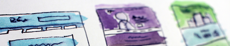
Static mockups have a number of limitations which can cause requirements changes during development. The most obvious drawback being that they are, of course, static. Websites are inherently interactive and a design produced in Photoshop or Sketch cannot truly convey interactivity; for example, how do buttons react when pressed or is an animation used when a user removes an item from their basket?
However, not only are they static is an interactive sense, they are also static in a responsive sense; mockups can’t articulate how the design will work across different screen sizes. Yes, a designer these days should produce mockups for a few different viewports – mobile, tablet and desktop – but these still don’t address what might happen in between these states but we can’t expect someone to design for every screen size or device in existence.
So what’s the alternative? Designing in code. If the product, site or service you’re designing is ultimately going to be delivered with code, isn’t it best to design in the same medium?
Getting design ideas “into the browser” as quickly as possible can have tremendous benefits as it allows you to quickly test the suitability of your ideas across different browsers and devices before investing too heavily in visual design. Does the component you’re designing work well on a touch screen? Is it keyboard accessible? Are the fonts legible on low-quality screens?
Not only that, but during show-and-tell sessions with the client, tweaks and changes can be demonstrated in real time using the browser’s developer tools. Need to change the colour of a button, or reorder form fields? No problem. The client wants to see how the project looks on their phone? Load it up and show them. Having a physical, working product in people’s hands can be very powerful and help steer conversations away from look and feel and more towards usability and interaction.
Whilst client feedback is massively important, having a working prototype means you can also conduct user testing in a more realistic fashion. User research during the design and development phase can provide valuable insights into how actual customers interact with the site and help the team to focus on addressing user needs. If the client is pushing for a specific feature to be included, it can be quickly integrated into the prototype and tested with users. If they find the feature useful, great, the team can work on refining it ready for production and if not, you have solid evidence to take back to the client as to why it shouldn’t be pursued.
You can also stress-test designs by using real-world content inside components. Visual designs tend to represent ideal scenarios, often with placeholder text edited to look neat and uniform and pleasing to the eye. With a prototype, you can test your components and see how they hold up with more or less content and at different viewport sizes. Quite often, tests like these will highlight issues the designer may not have even envisioned until much later in the process when it’s potentially too late to address.
Designing in code can also help bridge the gap between design and development as developers can better translate HTML prototypes into production code and understand how the design is intended to work across different viewports. The guesswork and back and forth dialogue between the teams is reduced as developers are no longer left to fill in the gaps left by static mockups.
Of course, there are drawbacks with this approach too. Unless you already have a prototyping framework in place, it can take longer to get up and running than simply opening up Photoshop and sketching something out. Your designers also need some basic knowledge of HTML and CSS, enough to get their ideas into the browser at least.
This can also lead to another problem as there needs to be acceptance that prototype code is exactly that – a prototype. This code isn’t intended for production but tightening deadlines can result in standards slipping and components which aren’t of the required standard making it into the live environment. It’s therefore important to have solid code standards and review processes in place to ensure quality standards are met. As designers become more familiar with the standards, their prototype code should naturally become closer to the required standards, ultimately reducing integration work as the project continues over time.
So, are static mockups dead? No, they just have a different role to play than they did in the past. Rather than designing full-blown mockups, designers can experiment with different colour palettes and treatments on components or check different typographic elements. Think of Photoshop like a digital sketch book rather than your one-stop shop for web design.
But what if you or your team aren’t comfortable writing HTML and CSS, are you stuck having to create static mockups? Not at all. There are a number of apps and services you can use to create interactive mockups of your designs:
Alternatively, if budget is tight or you’re reluctant to sign up for a subscription app like those listed above, you can get creative with PowerPoint or Keynote to create interactive demos.# Static Designs or Prototypes?
If you’re still presenting high-fidelity, static designs of websites to clients before beginning development, you may be doing yourself and your clients a disservice.
This design approach lends itself well to the traditional waterfall project lifecycle, whereby requirements are gathered and fed into the design process. In web development, this is when the mockups will be created and shown to the client, often with several rounds of feedback before sign off is achieved and the designs passed to the developers.
In a perfect world, all of the client’s requirements will have been gathered up front and the signed off design won’t change while the project is being built. In reality, this is rarely the case as clients often request changes after seeing the static design come to life on screen. The further into the development phase you are, the more costly these changes become as ever more integrated code is removed, rewritten and refactored.
Static mockups have a number of limitations which can cause requirements changes during development. The most obvious drawback being that they are, of course, static. Websites are inherently interactive and a design produced in Photoshop or Sketch cannot truly convey interactivity; for example, how do buttons react when pressed or is an animation used when a user removes an item from their basket?
However, not only are they static is an interactive sense, they are also static in a responsive sense; mockups can’t articulate how the design will work across different screen sizes. Yes, a designer these days should produce mockups for a few different viewports – mobile, tablet and desktop – but these still don’t address what might happen in between these states but we can’t expect someone to design for every screen size or device in existence.
So what’s the alternative? Designing in code. If the product, site or service you’re designing is ultimately going to be delivered with code, isn’t it best to design in the same medium?
Getting design ideas “into the browser” as quickly as possible can have tremendous benefits as it allows you to quickly test the suitability of your ideas across different browsers and devices before investing too heavily in visual design. Does the component you’re designing work well on a touch screen? Is it keyboard accessible? Are the fonts legible on low-quality screens?
Not only that, but during show-and-tell sessions with the client, tweaks and changes can be demonstrated in real time using the browser’s developer tools. Need to change the colour of a button, or reorder form fields? No problem. The client wants to see how the project looks on their phone? Load it up and show them. Having a physical, working product in people’s hands can be very powerful and help steer conversations away from look and feel and more towards usability and interaction.
Whilst client feedback is massively important, having a working prototype means you can also conduct user testing in a more realistic fashion. User research during the design and development phase can provide valuable insights into how actual customers interact with the site and help the team to focus on addressing user needs. If the client is pushing for a specific feature to be included, it can be quickly integrated into the prototype and tested with users. If they find the feature useful, great, the team can work on refining it ready for production and if not, you have solid evidence to take back to the client as to why it shouldn’t be pursued.
You can also stress-test designs by using real-world content inside components. Visual designs tend to represent ideal scenarios, often with placeholder text edited to look neat and uniform and pleasing to the eye. With a prototype, you can test your components and see how they hold up with more or less content and at different viewport sizes. Quite often, tests like these will highlight issues the designer may not have even envisioned until much later in the process when it’s potentially too late to address.
Designing in code can also help bridge the gap between design and development as developers can better translate HTML prototypes into production code and understand how the design is intended to work across different viewports. The guesswork and back and forth dialogue between the teams is reduced as developers are no longer left to fill in the gaps left by static mockups.
Of course, there are drawbacks with this approach too. Unless you already have a prototyping framework in place, it can take longer to get up and running than simply opening up Photoshop and sketching something out. Your designers also need some basic knowledge of HTML and CSS, enough to get their ideas into the browser at least.
This can also lead to another problem as there needs to be acceptance that prototype code is exactly that – a prototype. This code isn’t intended for production but tightening deadlines can result in standards slipping and components which aren’t of the required standard making it into the live environment. It’s therefore important to have solid code standards and review processes in place to ensure quality standards are met. As designers become more familiar with the standards, their prototype code should naturally become closer to the required standards, ultimately reducing integration work as the project continues over time.
So, are static mockups dead? No, they just have a different role to play than they did in the past. Rather than designing full-blown mockups, designers can experiment with different colour palettes and treatments on components or check different typographic elements. Think of Photoshop like a digital sketch book rather than your one-stop shop for web design.
But what if you or your team aren’t comfortable writing HTML and CSS, are you stuck having to create static mockups? Not at all. There are a number of apps and services you can use to create interactive mockups of your designs:
Alternatively, if budget is tight or you’re reluctant to sign up for a subscription app like those listed above, you can get creative with PowerPoint or Keynote to create interactive demos.


0 Comments