Choosing the Right Image Format

Introduction
Images are an important aspect of most websites, but if you aren’t careful you could be delivering poorly optimised ones to your users which can not only negatively impact the user experience but also your search engine rankings.
There are a number of different image formats to choose, so which is the best? As with most things on the web, the answer is “it depends”. The different formats available are optimised for different use cases and what works for one kind of image can produce undesirable results if an inappropriate format is used instead. This article will help guide you towards choosing the best format for the type of images you have.
Image Formats
The following image formats will be discussed in this post:
Most of these formats compress the data in your original file in one of two ways:
- Lossless – the meta data the file uses to create the image is compressed, but the final result is an image with no loss in visual quality compared to the original.
- Lossy – detail in the image itself is simplified compared to the original, which can produce significant file size reductions, but how perceivable this to your visitors is down to a number of factors.
GIF
The GIF (Graphics Interchange Format) is probably the most basic of image formats available to use on the web and is supported in all major browsers so you’re not likely to run into any issues if you use one on your site.
GIFs are saved using lossless compression, so the quality shouldn’t degrade when exporting from your source file. I say “shouldn’t” because GIFs only support up to a maximum of 256 colours so are only really suitable for simple images with large blocks of colour, such as a logo or icon. And if you’re thinking 256 colours sounds like a lot, bear in mind that modern displays support millions, if not billions, of colours.
GIFs also feature basic support for transparency, meaning background colours or objects can be seen through select parts of the image. This can be useful when a graphic is needed to be placed over different coloured backgrounds across your site – you can produce and reuse a single image rather than multiple ones with differing background colours. This has the added benefit of not needing to export new images should the site’s colour scheme change in the future. Unfortunately, this transparency effect is quite limited and images can often look “ragged” around the edges when it is used. View the example images to see this effect in practice.
With all that being said, should you actually make use of GIFs on your website? Probably not. It’s a very dated and limited format that is really only suitable for very basic graphical elements and even then other formats are probably more appropriate for your needs.
On animated GIFs
One fairly unique aspect of the GIF format is that it supports motion, allowing for some rudimentary animation on the web. Thanks in part to the death of Flash, animated GIFs have seen something of a resurgence in recent years as they are well-supported by mobile and desktop browsers. Whilst they can be amusing (who doesn’t love a cat GIF, after all?), and their simplicity lends them an old skool charm, they really should be avoided.
GIF was not designed to be a proper video file format and as a result produces files which are large, poorly optimised and which don’t take advantage of hardware and software optimisations available to more modern video formats. In practice, this means heavier, slower-loading web pages that consume more of your users’ bandwidth, data and battery. Animated GIFs can also be dangerous.
PNG
Due in part to the limitations of GIF (256 colours, basic transparency support) the PNG was born. Like GIF, PNG uses lossless compression so is great for the same sort of images but supports millions of colours and has much more advanced transparency features. This means that you can have much higher-quality graphics with the trade-off of a slightly larger file size.
Back in the early-to-mid 2000s, support for PNGs was a bit flakey in a few versions of Internet Explorer but as they are pretty much a distant memory these days, you should have no problem using PNGs on your site.
JPEG
The JPEG format can often strike the right balance between quality and file size. This is achieved through the use of a lossy compression algorithm, meaning your exported file will always be of lower quality than the source file you used to create it so it’s a good idea to keep your originals safe in case you need them again in the future.
JPEG excels when working with photography, where there is often lots of subtle variations in colour throughout the image. Were a photograph to be saved as a PNG, for example, the quality would be high (as no visual data is lost) but so too would the file size.
Using the export tool in an app like Photoshop allows you to choose the compression quality of a JPEG on a scale of 0 to 100% and preview the effect on the source image’s quality and file size in real time. This allows you to get the right balance between a good-looking image and a small file size: set the scale too low and the image will appear blocky with visible compression artefacts; set it too high and you will have a large file size with no discernible increase in quality over a sensibly-compressed image.
There’s no hard and fast rule or magic number for what compression percentage you should export an image at as what works for one image might not for another. In general, somewhere between 50 and 70% is often the sweet spot
One area where JPEG can’t compete, however, is transparency – the format simply does not support it so be mindful of this when creating designs and graphics.
SVG
The other image formats discussed in this post, despite their differences in compression techniques and features, are all just different forms of what we call raster graphics. Essentially, this means they have a defined grid of pixels, each set to a specific colour value, which when viewed as a whole makes up the image we see on our screens. Using a graphics editor such as Photoshop, you can zoom into a raster image and eventually see each pixel up close.
SVGs do not work like this. An SVG file is effectively computer code, which provides instructions to your device on how to draw the image relative to its bounding box. This makes SVGs resolution independent.
For example, say you had a graphic of a black star set at 300×300 pixels on your website and then were asked to make it twice as big, e.g. 600×600. If this graphic was in a raster format, such as PNG or JPG, doubling the size would make the image appear blurry as each pixel would have to be stretched to fill the space. In this example, each pixel of the graphic would be twice as big as it was intended to be.
However, if that graphic was an SVG, it could be displayed at any size with no loss in quality as the image is drawn by the browser in real-time as it renders the page. You can see a demonstration of this in the examples section of this post.
In a world where people can view your website on anything from a tiny 2.5 inch smartwatch to a huge 5K display (and anything in between) SVGs can be very appealing especially if your design calls for graphics which need to be displayed at different dimensions based on the size of the user’s screen.
Though you can make some very complex graphics in SVG, on the web they are best-suited to simple graphical elements such as icons and logos. Tools such as IcoMoon can even help with the creation of SVG icons for your site.
Support for SVG is very good in all modern browsers, though there are some issues with Internet Explorer 9 through 11 (there is no support in previous versions of IE).
Because they are programmatically generated, you can do a lot of clever things with SVGs that you can’t with other image formats. These are beyond the scope of this post, but this article on Using SVG over on CSS Tricks is an excellent starting point. Additionally, lots of really in-depth articles on SVG can be found over on designer and developer Sara Soueidan’s website.
WebP
As a relative newcomer, WebP support is nowhere near the almost universal support the other formats in this post enjoy. It was created by developers at Google to produce images with smaller file sizes than PNG or JPEG at equivalent quality settings. It can save images using lossless or lossy compression, whichever is more suitable, and supports transparency.
It’s clear that the intention is for WebP to become the de facto format for raster images but that can’t happen until there is much wider browser support for the format. So, if you do choose to implement WebP on your site, you’ll have to provide alternative image formats to the non-supporting browsers.
Examples
A Simple Graphic


A Simple Graphic with Transparency
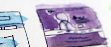
A Photographic Image


SVG
The following images are the same SVG, which is only 250
Compression services
Hopefully, you can now see the benefit of choosing the right image format but if you want to make your image files as small as possible – and why wouldn’t you? – then there are free services which can help. Most image editors leave additional metadata in image files which are not required for them to display them correctly, the services listed below are able to remove this data and compress your images even further with no additional loss of quality:
Additionally, some of these services provide APIs which allow you to automate the optimisation process if you’re using a build process, for example.
- By using ImageOptim on the images in this post, I was able to save around 45KB on the total size of the images with an average of a 17.9% saved per file. The maximum amount saved on one image was a massive 62.4%. ↩︎


0 Comments